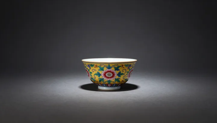
From the same kaolin clay and high-fired kilns emerged two visual systems that barely speak to each other. Blue-and-white porcelain turned cobalt pigment into a binary code of line and reserve. Overglaze enamels layered color on top of already fired glaze, creating a surface that behaves more like painting than pottery.
That technical fork produced different aesthetic incentives. Under the glaze, cobalt had to survive intense firing, rewarding clear contour, negative space and stable pattern, so value clustered around brush discipline and symmetry, a kind of visual entropy control. Enamels, fused at lower temperature, allowed fine color gradation, shading and narrative density; they favored pictorial illusion and shifting light, closer to panel painting than to functional ware.
Institutional demand then amplified the split. Court commissions treated monochrome blue as a symbolic code for order, ritual and repeatable standards, while polychrome sets became theatres of story, auspicious motif and status performance, exploiting the marginal utility of each added hue. Collectors today still judge by these inherited grammars, reading blue-and-white for structure and restraint, and overglaze color for image, drama and display.