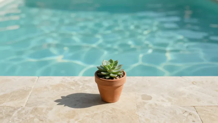
A bright blue pool and a stubby succulent cool the mind long before they touch the air. That feeling is not romantic; it is a processing error baked into sensory physiology and visual psychology.
Perception cheats. The pool’s saturated blue and the plant’s matte, water‑laden leaves feed into color temperature mapping and material perception, both of which sit upstream of conscious judgment in the visual cortex. Blue light is routinely coded as distant, shaded, and cool, while glossy, desiccated, or metallic textures skew warm in learned associations. Functional thermoregulation, driven by hypothalamic control and skin thermoreceptors, still tracks the actual air temperature, yet the brain’s predictive coding layers lean on these visual priors when estimating comfort, so the scene feels cooler than any thermometer would allow.
Designers bet on this bias. Architectural psychology and environmental ergonomics both show that blue‑dominant palettes and soft, hydrated textures lower reported heat stress and even nudge heart rate and perceived exertion. The succulent acts as a tiny, silent proxy for stored water, while the pool reads as a large evaporative surface, so the brain forecasts relief even if convection and humidity barely change. Around that small plant and that artificial lagoon, what cools first is not the body, but the story the brain tells about it.