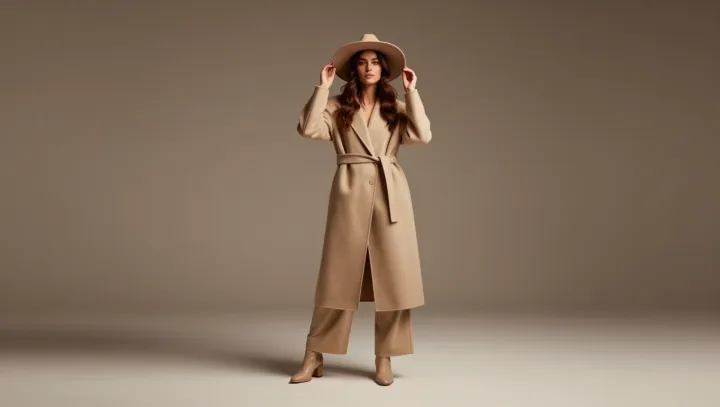
Beige is not bland; it is a visual mute button. When saturated color steps aside, the eye stops chasing hue and begins to map structure, much as edge-detection in computer vision software prioritizes outline over chroma. On a beige coat, the curve of a dropped shoulder or the sharp angle of a peaked lapel reads with almost architectural precision, because nothing loud is competing for neural bandwidth.
The real surprise is how aggressively neutral fabric amplifies shadow. A monochrome beige column dress turns every fold, dart, and seam into a topographic line, as directional light carves out micro-contrasts along the body. Psychophysics studies of contrast sensitivity show that human vision locks first onto luminance shifts, not color variation, so a field of near-identical beige tones becomes a clean stage for those tiny gradients to perform.
Texture, too, suddenly shouts. A ribbed knit in one beige reads almost sculpted against a matte twill in another, because without chromatic noise the brain leans on surface cues like specular highlight and diffuse reflection to decode depth. What people call boring beige is, in practice, a ruthless editor, cutting the visual subplot of color so silhouette, shadow, and texture can finally take the lead.