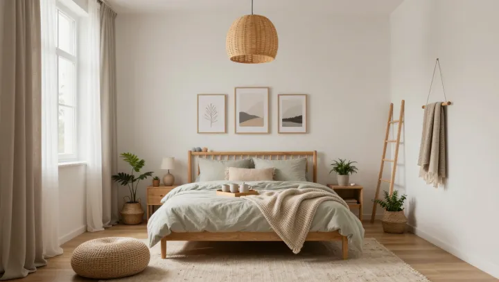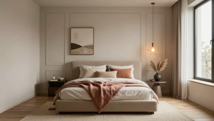
A nearly bare bedroom can look more expensive than a decorated one when color contrast drops. Soft beige walls, sand-toned textiles and cream upholstery sit close on the Munsell value scale, so the eye stops hunting for edges and starts reading the space as continuous volume, the way hotel suites are engineered to feel larger than they are.
The real upgrade comes from temperature control, both chromatic and literal. Warm neutrals trim the blue from reflected daylight, while copper accents act like tiny dimmers, bouncing light at a lower color temperature than chrome or stainless steel because of their longer-wavelength reflectance. A single copper lamp base, a slim frame, even a tray on the nightstand introduces a controlled highlight that feels intentional instead of ornamental.
What reads as luxury is restraint underpinned by optical physics. By limiting contrast ratios between walls, bedding and flooring, designers flatten visual noise and let luminance gradients, not objects, do the work. The copper notes then function like specular anchors in a rendered image, giving the room depth and hierarchy without clutter. Strip the art, skip the pattern; keep the temperature, keep the glow.