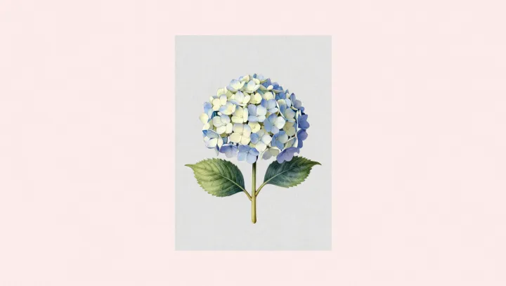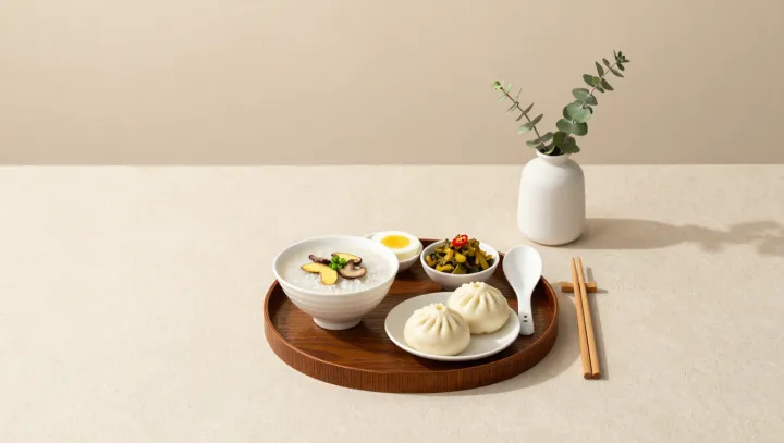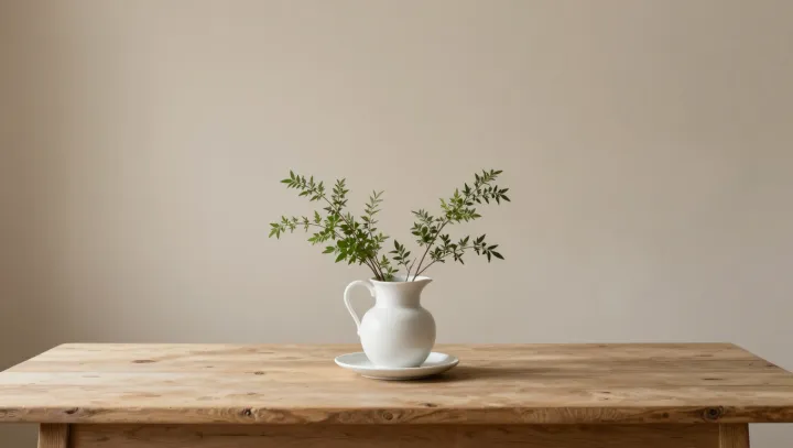
Negative space, not more roses, is what high‑end florists now sell as calm. Sparse vases, long stems, bare water between them; the emptiness is deliberate, not stingy. By reducing visual density, designers say they give the visual cortex a simpler signal to decode, so the entire mood of an arrangement is registered in a flash rather than pieced together detail by detail.
The counterintuitive claim is that a crowded bouquet actually agitates attention. Too many heads, too many color shifts, and the brain’s feature integration and saccadic eye movements work harder, scanning and rescanning. With wider gaps, the figure‑ground relationship stays obvious, and peripheral vision can map the whole composition almost instantly, which matches how humans read horizons, not cluttered shelves. Calm comes less from pastel tones than from low information load that shortens that first appraisal to under a second.
Luxury studios lean on this science as a differentiator. They stretch a single stem above the rim, expose negative space like white margin on a printed page, and price it as visual hygiene for overstimulated interiors. The flowers carry the scent and color; the emptiness carries the exhale.