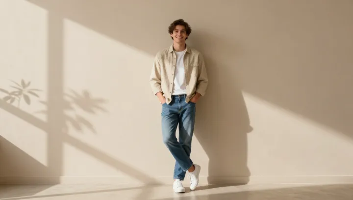
A light beige overshirt does more for body balance than most garments marketed as slimming. Not by magic. By quietly editing what the eye is allowed to notice and where it is allowed to stop.
The sharper the contrast, the shorter the body reads. That is the unfashionable truth. A dark torso against pale trousers creates a hard horizon line at the waistband, compressing the leg visually through figure–ground separation and luminance contrast. A beige overshirt, close to mid-value on the gray scale, softens that split. Worn over a similar-toned tee and slightly darker trousers, it stretches the vertical block of color so the body is scanned as one column rather than two competing halves.
Cuts obsess over centimeters. Color placement moves whole proportions. The overshirt’s open placket draws two clean vertical channels down the front, a kind of low-tech trompe-l’oeil that functions much like a guiding gridline in graphic design, steering the gaze up and down instead of side to side. Dropped shoulders in a rigid fabric would add width; in a light, softly structured beige, the shoulder line blurs rather than shouts, reducing apparent bulk while the hem, sitting slightly lower than a typical shirt, lowers the perceived midpoint of the body. The result is not a thinner person, just a better negotiated silhouette.