A perfectly matched bedroom can feel strangely unfinished. The problem is sameness. When bedding, walls, and furniture reflect light in much the same way, their edges and surfaces become harder to distinguish; the room reads as one pale plane rather than a collection of inviting places.
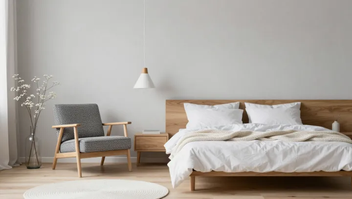
Texture does the work that color need not. Against smooth white bedding, a textured throw catches light on its raised fibers and casts small shadows into its folds. Warm wood adds a firmer counterpoint: its grain introduces fine variation, while its solid surface gives the softness of the bed something to play against. This is materiality at its most useful. The patterned armchair adds another rhythm, drawing the eye away from the bed without demanding a brighter palette. Its motif can be quiet, provided it remains distinct from the surrounding fabrics.
Contrast matters more than matching. Designers call the difference between light and dark tones value contrast, and even a modest shift can separate a chair from a wall or a throw from a duvet. The pendant light contributes by shaping shadows as well as illuminating the room; its simple form leaves the other materials room to speak. Restraint still needs editing. Too many similar woven surfaces can blur together, just as too many patterns can compete, so the better test is whether each element brings a different quality. In the quietest room, a fold of fabric can hold the eye as surely as a splash of color.