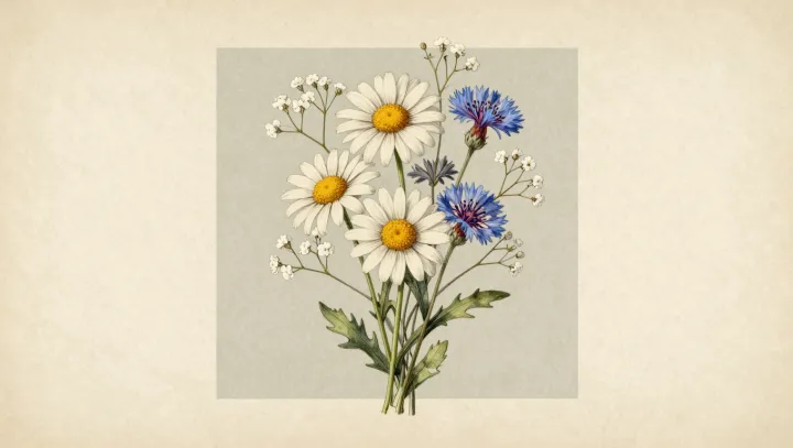
Blue beside white wins. Where a cornflower's cobalt florets meet a daisy's pale ray petals, the eye receives a hard chromatic boundary; even when watercolor drains much of the scene's saturation, that boundary keeps its force. Optics, not sentiment. The pairing works because blue and white give vision radically different jobs.
Blue carries the argument. In cornflowers, an anthocyanin-based supramolecular complex often called protocyanin absorbs broad portions of visible light while returning light weighted toward blue; the result is a cool, high-chroma note against the daisy. White amplifies it. Daisy petals generally appear white because multiple scattering at cell-wall and air interfaces returns many wavelengths together, rather than because one white pigment takes command. Simultaneous contrast makes the blue seem deeper beside that near-neutral field.
Watercolor sharpens the bargain. As washes mute surrounding hues, the cornflower retains a concentrated blue cue while the daisy behaves like a small reflector, preserving separation without heavy paint or dark outlines. The eye prefers this argument. A blue flower and a white flower, held in the same quiet wash, can make restraint look almost defiant.