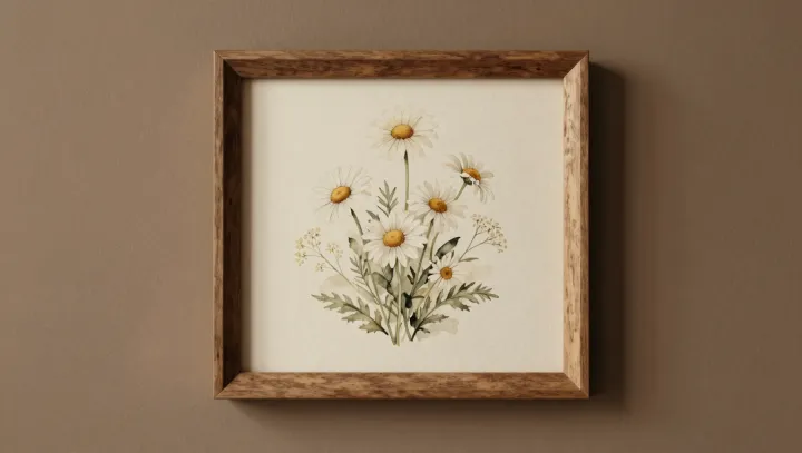
Cream daisies seem switched on. Nothing in the petals has changed; the visual system compares each pale surface with quieter neighbors and assigns it greater apparent lightness through simultaneous contrast. The change is subtle. At a garden border, though, it can give an ordinary flower the arresting presence of a lit window.
Backgrounds do the work. Muted sage and ochre restrain chroma and commonly sit below cream in relative luminance, so the eye reads the petal edge as a sharper departure rather than a bland adjacency. Not flower magic. Color appearance depends on context: retinal processing uses lateral inhibition to heighten differences at boundaries, while cortical interpretation helps settle what looks white, cream, dim, or bright. The petals borrow no photons. They borrow contrast.
Designers miss this bargain. Push the surrounding field toward greater saturation or lightness, and the daisies lose their charge because the comparison weakens; darken it too much, and a quiet planting becomes theatrical. Restraint wins here. Cream remains cream, yet a hush of sage and ochre can make it appear briefly, almost improbably, self-illuminated.