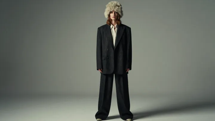
Sepia is the shortcut. Side lighting does the finer work, giving a loose khaki suit the surface detail and separation that a brown tint alone cannot supply. Texture earns the vintage impression. When illumination crosses the cloth rather than striking it squarely, small shadows describe the weave, while folds acquire enough depth to suggest tailoring rather than surplus fabric.
Flatness is the enemy. Under frontal illumination, which reduces many visible shadows across the jacket, generous proportions can read as an undifferentiated block instead of a deliberate cut. Diffuse reflection explains part of this. Light scatters from the fabric's surface, but its direction still changes which ridges catch brightness and which recesses remain shaded. Restraint beats theatrical darkness. A window to one side, with gentle ambient fill on the other, can reveal lapels and sleeve folds without burying half the garment in black.
Separation matters more than tint. Against a background close to the suit's brightness, even handsome fabric can lose its outline, so luminance contrast deserves attention before any color treatment begins. Distance can help, too. Moving the wearer away from a wall gives the photographer more freedom to control background brightness independently, though placement alone guarantees no particular result. Keep the highlights under control. If exposure washes out the lit shoulder, the very texture that gives khaki its character disappears, leaving a pale patch where cloth should be. The filter can wait. Along one illuminated lapel, the suit carries its own quiet suggestion of age.