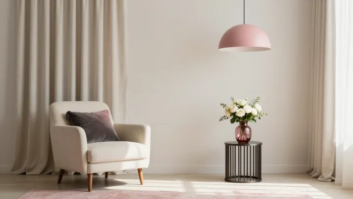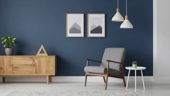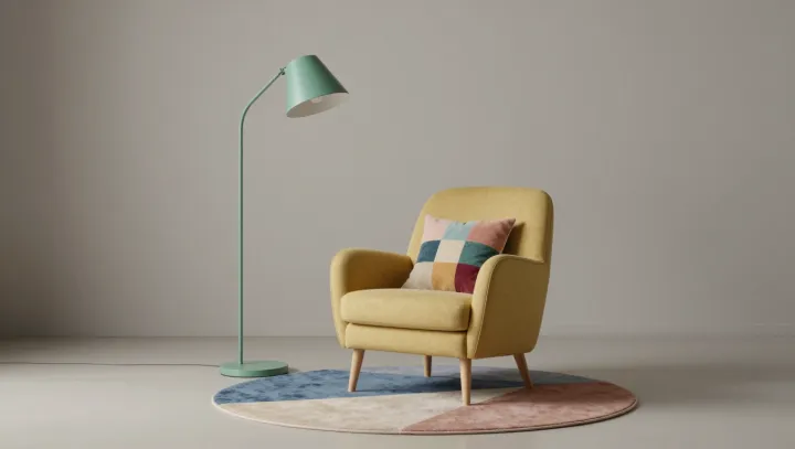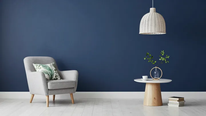
A reading corner feels better when the page, not the whole room, commands the light. The distinction is practical. A pendant shade can direct illumination toward a book while leaving the surrounding space softer, giving the eye enough information to read without turning a quiet corner into an evenly lit stage.
Brightness alone is a poor measure of comfort. What matters is illuminance on the page and the balance of luminance across the reader's field of view. Too little light can make small print harder to distinguish; an exposed bulb or a bright reflection can produce glare. A shade helps by screening the source and directing light where it is needed. Placement matters, too. Set the light so that the head and hands do not cast heavy shadows across the book, and adjust its position if the paper reflects light into the eyes. A modest difference between page and background is often easier to live with than an abrupt contrast.
The chair and its surroundings deserve the same restraint as the light. A cushioned armchair offers support for a longer read, while natural wood brings a tactile counterpoint to the navy wall. Greenery softens that contrast. The dark wall can help the lit page stand out, though its effect depends on the paint finish and the direction of the light. Add a small surface within reach for a cup or glasses, and leave enough room to settle into the chair without shifting furniture. The most inviting room is not necessarily the brightest; sometimes its pleasure lies in what the light chooses to leave alone.