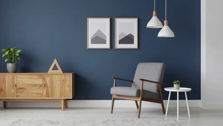
A deep blue wall need not dominate a living room; its power depends on what stands beside it. Pale upholstery gives the eye room to rest, while white accents sharpen the boundary between dark and light. The contrast does the work. Natural wood and greenery then soften a scheme that might otherwise feel too severe.
Contrast, not restraint alone, makes the palette convincing. In color theory, value describes the lightness or darkness of a surface: a dark wall gains definition against a pale sofa, but loses some of its force when surrounded by similarly dark furnishings. Proportion matters just as much. If blue occupies one broad plane and neutral tones cover much of the seating and floor, the wall can act as an anchor rather than an enclosure. White need not appear everywhere; a few accents can catch the eye without competing with the larger fields of color.
Lighting can change the verdict. Daylight shifts across the wall, revealing variations in the paint, while lamps can illuminate upholstery and wood that might otherwise recede into shadow. Color temperature matters too: warmer light can lend wood a richer appearance, while cooler light may make the blue seem sharper. Test the paint in the room before committing, and look at it beside the actual fabrics rather than judging a sample in isolation. No fixed ratio guarantees harmony. The wall holds its depth, and the room keeps its air.