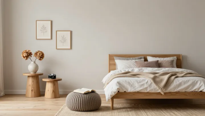
Warmth has little to do with a paint swatch. A Scandinavian-inspired bedroom can feel inviting in pale gray and white because comfort is also read through touch, light and the irregular grain of wood. The palette stays quiet, while the surfaces do the talking. That distinction matters.
Texture is the room's most persuasive argument against starkness. A linen cover, a wool throw and a soft rug give the eye differences to follow, even when their colors sit close together. In design terms, tactile contrast supplies variety without visual clutter. Natural wood adds its own irregularity: grain and knots keep a simple bedside table from looking as uniform as the wall behind it. Less can feel generous.
Light, not color alone, decides how those surfaces appear. Daylight grazing a woven blanket reveals its raised threads; diffuse light softens shadows that might otherwise make a spare room seem severe. A bedside lamp with a shaded bulb can make reading comfortable while keeping the rest of the room subdued. Simple furnishings leave space for that light to move, and layered bedding offers an invitation that no decorative flourish needs to announce. On the pale wood, the last patch of light settles into the grain.