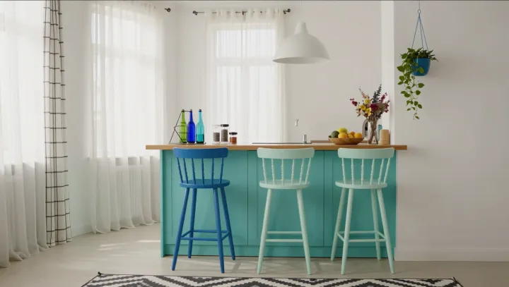
A kitchen needs less blue than one might think to be remembered for it. The turquoise island makes the argument at once: surrounded by white walls, it claims attention without asking every surface to join in. The effect is crisp, not monochromatic. Painted stools repeat the accent, giving the island company without diluting its force.
The restraint is the design. In terms of visual hierarchy, the island is the first thing to register, while the stools carry the eye outward in smaller steps. White walls give the saturated color room to stand apart; natural wood introduces warmth that keeps the contrast from feeling severe. Bold geometric textiles add another kind of energy, their patterns offering movement where the larger surfaces remain comparatively quiet. Not everything must match. The room gains its identity from the relationship among these elements, rather than from a single color applied everywhere.
The lesson is placement, not volume. A homeowner seeking a similar effect could begin with one substantial blue element, then repeat the hue on a few smaller pieces before deciding whether anything else is needed. A painted island makes a stronger commitment than a pair of stools, so the choice also depends on how readily the scheme should change. Leave some surfaces alone. Against the pale walls and wood, the blue can hold its ground without taking over. The island remains a bright note in a room that still has space to breathe.