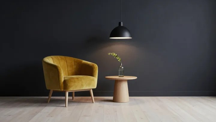
A dark wall can make a yellow chair look brighter without changing the fabric at all. The wall does much of the work. Against charcoal or deep blue, the chair commands attention; against a pale background, the same upholstery may seem quieter and less distinct.
The eye is a comparative instrument, not a paint scanner. In simultaneous contrast, the perceived lightness of a surface depends partly on the lightness of its surroundings: a brighter area often appears lighter beside a darker one. Lateral inhibition, a process in which signals from neighboring retinal cells influence one another, helps sharpen boundaries and contributes to contrast effects. The visual system also interprets color in context, so the precise appearance depends on more than a simple comparison of brightness. Context changes the reading. The yellow fabric itself need not change.
A dark wall is not automatically the best choice. If the aim is a room with a pronounced focal point, a deep backdrop gives the chair a clear visual edge; a light wall lets it settle into the room. Test the fabric beside paint samples under the lighting the room will actually use, because a wall that reflects less light can also change the illumination falling on nearby objects. Keep the comparison honest. The chair may stay put, but the room around it is never merely background.