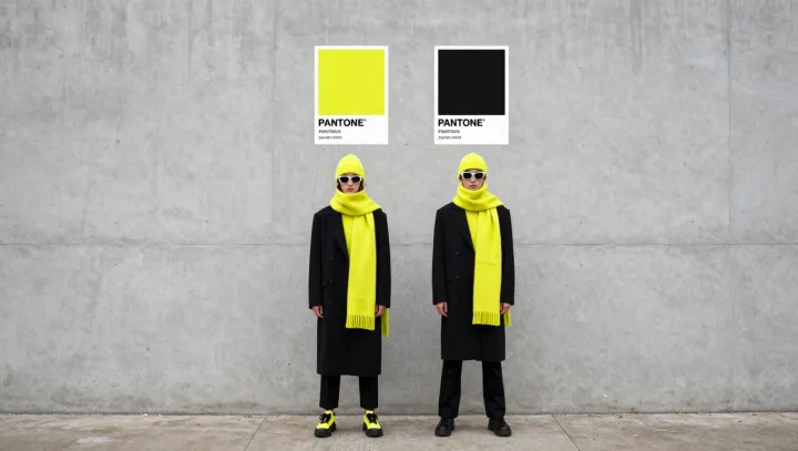
Color on a rack may look identical, yet on two bodies it behaves like two different systems. Designers say a color can be “mathematically wrong” because the eye does not judge hue in isolation; it runs a rapid calculation involving skin undertone, silhouette, and surrounding context, almost like a built‑in algorithm for visual efficiency.
On the runway, that algorithm is engineered. Models are chosen for consistent body geometry, and garments are cut to manipulate proportion and perceived volume, using principles close to projective geometry and figure–ground perception. A high‑saturation shade framed by precise lines can narrow the torso, sharpen edges, and accelerate the viewer’s saccadic eye movements, which the brain often reads as energy and alertness. Under controlled lighting and makeup, undertones are neutralized, so the color locks into a stable contrast ratio that reads intentional rather than accidental.
Everyday life breaks that equation. Real environments add mixed color temperature, cluttered backgrounds, and uncontrolled luminance levels. A hue that was calibrated to a model’s balanced undertone and symmetrical proportions may, on another body, collapse key ratios of brightness and chroma, amplifying shadows or redness and disturbing overall color harmony. What looks like a simple preference is, in practice, a small shift in variables that flips the outcome of the entire visual system.