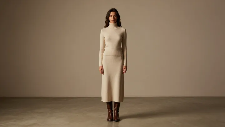
Color, not calories, often decides how tall you appear. When ankle boots echo the shadow tone of a cream knit maxi dress rather than its brightest highlight, the eye reads a single controlled column instead of three chopped blocks. That column is not about magic; it is about value, the light-to-dark scale that painters and photographers treat as non‑negotiable structure.
Stylists rarely admit it bluntly, but height is mostly a story your visual cortex tells itself. Match the boots to the dress’s internal shadow value and you tighten that story line, because abrupt value contrast at the ankle acts like a horizontal stop sign, forcing the eye to pause, then restart. By keeping dress and boots in the same value band, you reduce that interruption, so the gaze tracks in a clean vertical scan from floor to shoulder, the way a continuous contour line works in figure drawing.
The counterintuitive part is that “perfect match” is less effective than “shadow match.” A boot identical to the lightest cream can look bulky, almost cartoonish, while a slightly deeper, shadow-echoing brown behaves like built‑in shading. It reinforces edge definition through simultaneous contrast, sharpening the outline without adding width. Nothing on the body changes: only the value map does. Yet the viewer reads extra height, a leaner frame, and a more intentional silhouette.