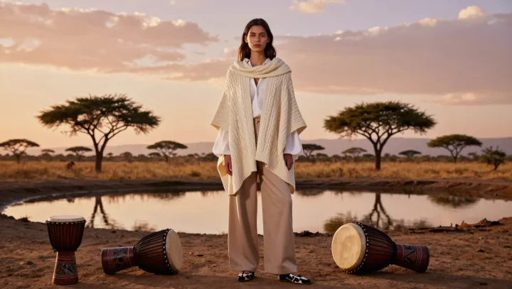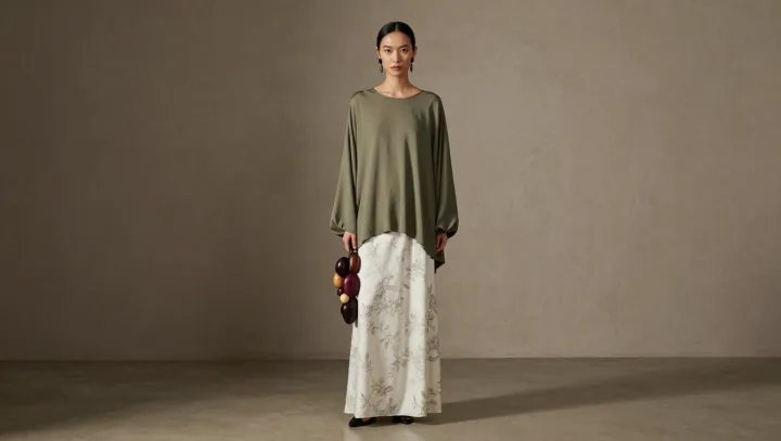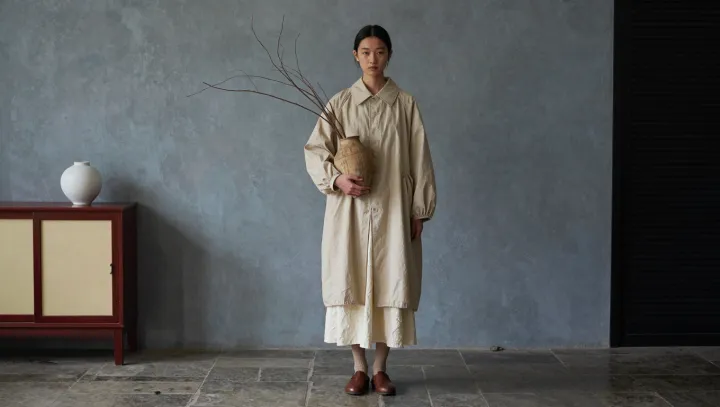
Exact matches can make beige look flat. A model's layered outfit makes the case for a subtler approach: related shades, rather than identical ones, allow each piece to register while keeping the overall impression calm. The effect depends less on finding one perfect color than on managing the differences between several.
Undertones do much of the work. A warm beige with yellow or peach beneath it will generally sit comfortably beside cream and camel; a cooler beige with a gray cast may feel more at home with taupe. Mixing warm and cool tones can work, but a noticeable difference in value, the relative lightness or darkness of a color, helps make the pairing look deliberate. Consider the fabrics, too. A matte knit absorbs light differently from a smooth, lustrous cloth, so two garments that appear similar on a hanger may diverge once worn together.
Contrast, not sameness, gives the outfit its shape. A lighter layer against a deeper one can trace the line of a sleeve or hem, while varied textures keep flowing silhouettes from dissolving into a single expanse of fabric. Proportion matters as well: a long outer layer over a shorter piece creates separation without introducing another color. Too little contrast can blur the ensemble; too much can interrupt its quiet rhythm. Between those extremes lies the pleasure of beige: a palette restrained enough to let the smallest differences speak.