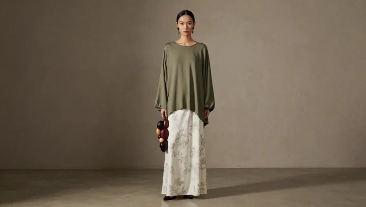
An olive blouse does not need a matching green in a printed skirt to look intentional. It needs compatible company. When the skirt carries pale, subdued colors, the blouse can sit comfortably beside them, its solid fabric giving the eye a place to rest while the print supplies movement.
Shared intensity matters more than shared pigment. Saturation describes the strength of a color, and a dusty rose, soft beige or muted blue can feel at home with olive because none appears especially vivid. Value, the relative lightness or darkness of a color, adds another layer: a darker blouse against a pale skirt creates definition without demanding an exact match. The contrast has a purpose. A bright, highly saturated print, by comparison, may make a subdued olive top seem less connected, though a repeated accessory or a deliberate styling choice can bridge the difference.
The solid blouse is the outfit's quiet advantage. Against a patterned maxi skirt, it gives the print room to register without adding competing detail; a simple tuck or a defined waist can also give the long silhouette shape. Accessories need not repeat every color in the skirt. Tan shoes, a brown belt or a bag picked from one of the print's softer shades can reinforce the restrained palette, while their texture adds interest without introducing another busy pattern. The balance remains flexible. In the finished outfit, the green stays apart from the print, and neither piece has to surrender its character.