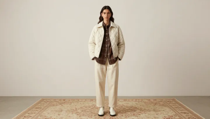
The quilted jacket makes the plaid work, not the other way around. Its off-white surface gives the brown shirt a quiet setting, while white trousers carry that lightness through the outfit. The contrast is deliberate. Rather than competing for attention, the layers assign the shirt the leading visual role.
Scale matters more than matching. Quilting creates a repeated surface pattern, but its stitching generally reads as texture from a distance; plaid, with its intersecting lines, tends to announce itself more readily. When the checks are noticeably larger than the quilted sections, the eye can distinguish one rhythm from the other. Similar-sized patterns can compete. That does not make them forbidden, but it does mean color and spacing must do more work to separate the layers. A shirt with a restrained palette also leaves room for the jacket's stitching to register without turning every inch of the outfit into an argument.
Contrast is most useful when it has boundaries. Here, brown stands apart from the pale jacket and trousers, yet the limited palette ties the pieces together. A narrow glimpse of plaid at the collar or through an open jacket can be enough; exposing more of the shirt gives the pattern greater weight. Let the fabric decide. Thick quilting already adds dimension, so a smooth trouser surface offers a welcome pause. The result is not an absence of detail but a hierarchy: one pattern speaks, another stays close, and the pale space around them holds the conversation.