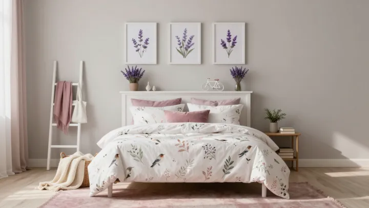
A bedroom gains coherence from variation, not from a single print repeated without pause. Large botanical motifs on bedding can establish the room's visual center, while smaller leaves or flowers elsewhere keep the eye moving without demanding equal attention. The difference matters. Lavender accents, blush textiles, and white furnishings give those patterns a shared setting.
Scale contrast is the quiet discipline behind the effect. When one print is large enough to read from across the room and another reveals its detail only at close range, each occupies a distinct place in the visual hierarchy. Repeating the same motif everywhere can flatten that hierarchy, making the bedding, cushions, and surrounding textiles compete for the same amount of attention. A shared palette holds them together. Lavender can reappear in a small detail, while blush softens the transition between patterned fabric and plain surfaces. White furniture offers breathing room, allowing the prints to remain visible without covering every surface.
Restraint makes the mixture more convincing. A small botanical print need not match the bedding leaf for leaf; it can echo a color or a loose, natural shape instead, leaving each fabric with its own character. Keep some surfaces plain. A blush throw or an unpatterned cushion can separate two prints, giving the eye a place to rest and making their differences easier to appreciate. The result is a room that feels coordinated without looking prescribed, as though its garden has been allowed to grow in more than one direction.