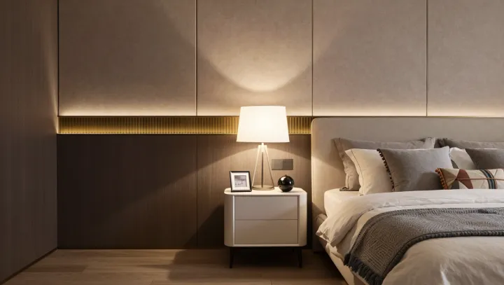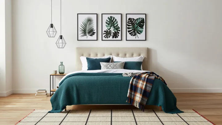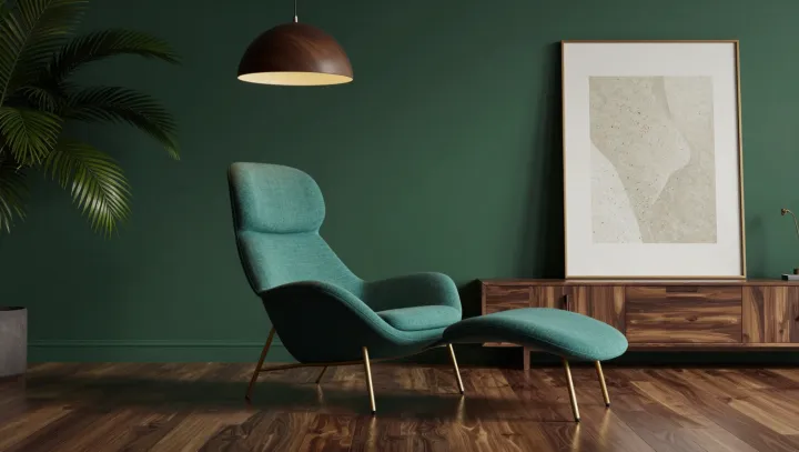
A deep green wall makes a stronger room when the furniture refuses to match it. The wall supplies the visual weight; a teal chair, pale artwork, wood and leafy plants give that weight somewhere to go. Exact repetition would be flatter. A shared color sensibility, rather than a matching set, holds the scene together.
Undertones matter more than labels. A green with a blue cast can sit comfortably beside a teal chair because both lean cool, even when one is dark and the other vivid. Warm wood need not fall into line: its amber notes provide contrast, especially if the grain is visible against the wall. Light artwork creates another useful distinction. Its higher value, the design term for relative lightness, gives the eye a place to rest and keeps the dark surface from swallowing the room. Plants can echo the wall loosely, without pretending that every leaf belongs to the same paint sample.
Lighting can overturn the neatest color scheme. Daylight shifts across a wall, while lamp color temperature changes how warm or cool its green appears; a shade that seems balanced near a window may look muddy in a dim corner. Test before committing. Paint a large sample and view it beside the chair and wood under both daylight and the lamps used in the room. Diffuse light softens shadows, while a directed lamp can draw attention to the artwork or a plant. Leave some darkness intact. Against it, the pale picture seems to float, and the chair remains distinctly itself.