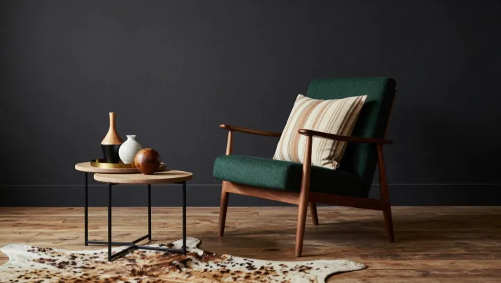
The dark wall does more for the green armchair than another coat of paint could. It changes the company the color keeps. Against a deep background, the upholstery can look lighter even when its material and the light falling on it remain unchanged. The chair holds its ground. The eye adjusts the scene around it.
Color is less an isolated property than a negotiation with its surroundings. One mechanism is simultaneous contrast: a surface can appear lighter when it sits beside a darker one. The difference in luminance, the light reaching the eye from each surface, helps set the terms of that comparison. Edges matter here. Where chair meets wall, the visual system registers a sharp difference, and that boundary can make the upholstery stand out. Warm wood and light accents add other points of comparison, though their effect depends on their placement and the light in the room.
A darker wall is not a substitute for good light. It changes apparent brightness, not the pigment in the fabric, and a dim room may leave the chair looking subdued rather than luminous. The practical test is simple. Compare the upholstery against dark and light backgrounds under the same illumination, keeping shadows and reflections as consistent as possible. If the wall itself changes how light bounces around the nook, the chair may receive different light as well. What seems like a fixed color becomes a small argument between the object and everything beside it.