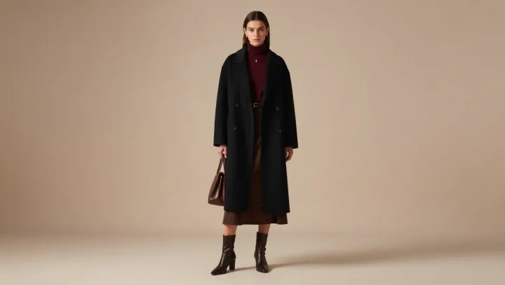
Dark colors do not need brightness to create depth. They need differences. In this outfit, a loose black coat frames a burgundy top and a textured brown skirt, while polished boots catch the light below. Each piece remains close in darkness, yet its hue, surface and shape give the eye somewhere else to go.
The strongest contrast here is not simply between colors. It is between surfaces. Black absorbs attention as a broad outer frame, while the skirt's texture breaks up the light that falls across it; the smoother boots answer with a sharper reflection. Burgundy, set between coat and skirt, introduces a red undertone without disrupting the subdued palette. Designers call this interplay of light and darkness value contrast, but hue contrast matters too: brown and burgundy can look distinct even when neither is markedly lighter than black.
Proportion does as much work as color. The loose coat creates a generous outline, and the visible top and skirt interrupt that expanse, allowing the layers to read as separate pieces rather than one dark mass. The polished boots give the eye a defined finish. Keep the coat open enough to reveal those inner colors, and the outfit gains a sense of distance between its layers; close it entirely, and much of that exchange disappears. Against the black frame, the quietest distinctions hold their ground.