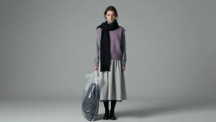
Light catches the raised loops of a gray knit vest before slipping into the shadows between them. Gray is rarely flat. Against a pleated skirt and a black scarf, the vest makes a case for restraint: when color steps back, the eye has more room to notice the surfaces and shapes that give clothes their presence.
Texture does the work that bright color might otherwise do. The knit scatters light through diffuse reflection, while its projecting loops and recessed spaces produce small variations in brightness. The pleats operate at a larger scale. Each fold presents a different angle to the light, creating alternating bands of highlight and shadow even where the fabric itself remains the same gray. Luminance contrast gives those differences definition. A colorful outfit can have the same play of light, of course, but competing hues may draw attention away from it.
The black scarf is the sharpest decision in the ensemble. It sets a dark boundary against the gray, making nearby tones appear more distinct and giving the eye a place to rest. The vest and skirt, by contrast, build interest through changes of surface rather than a dramatic change of color; their separate structures keep the outfit from reading as a single block. Nothing here needs to shout. In the folds and stitches, gray becomes less a color than a way of watching light move.