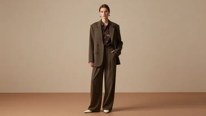
A printed top can make an olive suit look more coherent, not less. The reason is restraint. Brown and olive share an earthy warmth, so the top introduces contrast without pulling the eye away from the blazer and matching wide-leg trousers. Its pattern adds movement where a plain layer might leave a broad, uninterrupted block.
The best contrast here is a quiet one. Brown sits close enough to olive in mood to feel related, while differences in hue and chroma give the two colors their own identities. If the print includes lighter or darker marks, those variations can soften the shift between jacket and top, making the combination feel considered rather than matched by force. Scale matters, too. A smaller motif tends to read as texture from a distance; a larger one makes the shirt a more assertive focal point. Neither is inherently better, but each changes how much attention the tailoring receives.
Relaxed tailoring benefits from a little interruption. A wide trouser leg and an easy blazer create generous shapes, and a patterned layer draws attention inward without requiring a sharper cut. Keep accessories simple if the print is busy, or pick up one of its colors in a shoe or bag for a more deliberate finish. The choice is a matter of emphasis, not a rule. Against the long lines of the suit, the print holds its place: a small disturbance that lets the whole outfit settle.