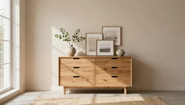
Warmth is less about furniture quantity than about where your eye lands first. Branch height sets the opening note. Low, slightly spreading branches pull the visual field down, nudging the vestibular system toward stability and lowering arousal; high, spiky stems yank attention upward, which the amygdala reads as alert. One vase, one decision, a big shift in baseline calm.
Texture, not color, usually does the heavy lifting. A matte, faintly irregular vessel recruits somatosensory cortex through visual–tactile association, mimicking the feel of stoneware in the hand and boosting perceived warmth even when the palette stays neutral. By contrast, a glossy, flawless cylinder signals low friction and low grip, which the brain loosely groups with formality and social distance.
Even frames and furniture are running quiet experiments on you. Slight frame overlap on a wall creates occlusion, a depth cue that gives your hippocampus more spatial data, which reads as lived‑in rather than staged. A dresser in a mid‑value, desaturated tone narrows luminance contrast, easing the work of visual accommodation. Then the rug: a tighter, looped weave throws crisp micro‑shadows that feel cooler, while a looser, plush weave scatters light and suggests thermal softness, enough to change estimates of room temperature by small but measurable margins.
The surprise is brutal in its simplicity. Five micro‑choices, all operating through depth perception, luminance contrast, and tactile memory, can bend your sense of welcome more efficiently than replacing every chair in sight, leaving the room almost unchanged yet psychologically reordered.