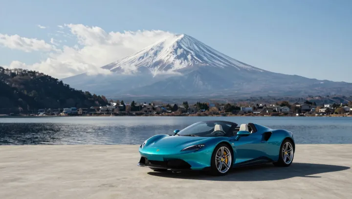
Blue-green is the sharper lens. Across a Ferrari's flanks, a blue-green finish can turn a routine silhouette into an event, because the hue changes its apparent balance as sun, cloud, and streetlamp alter the incident spectrum. Red announces itself at once. It is so culturally familiar that the eye often files the bodywork under a preexisting category before tracing its creases.
Rarity does more than flatter. A scarce color interrupts recognition, forcing attention back onto the object; viewers inspect the haunches, wheel arches, and cabin taper rather than relying on the stored image of a red sports car. Paint becomes an instrument. Its spectral reflectance governs which wavelengths return to the eye, while the bidirectional reflectance distribution function, or BRDF, describes how curved clearcoat redirects light. The geometry has not moved. Yet turquoise notes can cool a shadow, green notes can sharpen an edge, and blue can sink a recessed panel, producing a surface that seems newly drawn.
Familiarity is the disguise. Red can be magnificent, but its association with Ferrari is so strong that color and badge merge, leaving less perceptual room for sculpture. Blue-green refuses that shortcut. Under changing illumination, its hue and luminance shift across convex and concave panels, making the car's surfacing read as a sequence of decisions rather than a single iconic outline. The design remains fixed. An unusual finish restores attention to details that habit had blurred, and in that small act of seeing, the parked car becomes less an icon than a body caught in weather.