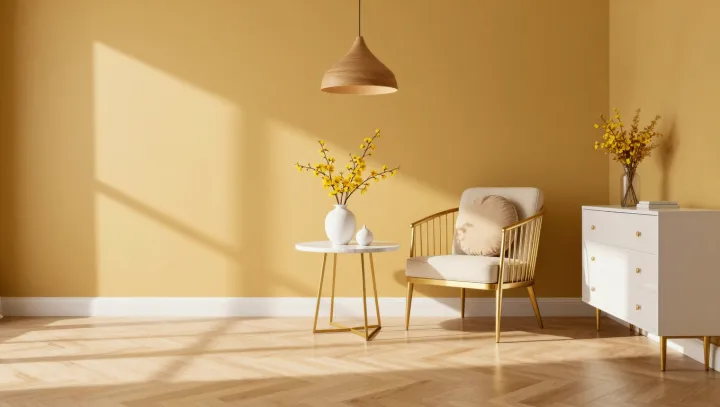
Yellow walls can rob gold furniture of its sparkle. The problem is proximity: when wall and finish share a similar hue and brightness, the eye has fewer differences to separate them. Gold remains reflective. Yet its highlights can disappear into a surrounding field that seems almost as warm and luminous.
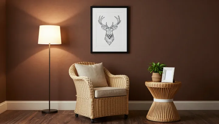
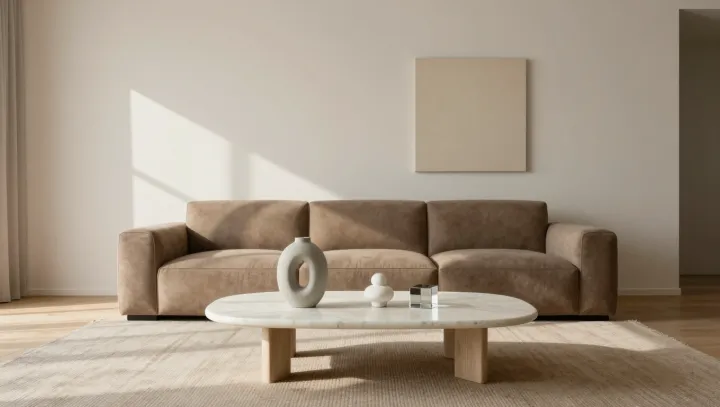
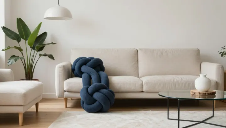
Contrast does the work that color alone cannot. A charcoal side table, a deep green cushion, or a darker strip of wall behind a gold frame can increase luminance contrast, making bright reflections easier to notice. Matte upholstery adds another distinction: unlike fabric, polished metal produces specular reflection, sending concentrated highlights toward the eye. Neutral seating need not be pale; a midtone fabric can give the furniture an edge without breaking the room's calm. Floral accents with dark stems or leaves can introduce smaller pockets of contrast, while repeating yellow in the petals keeps the composition connected.
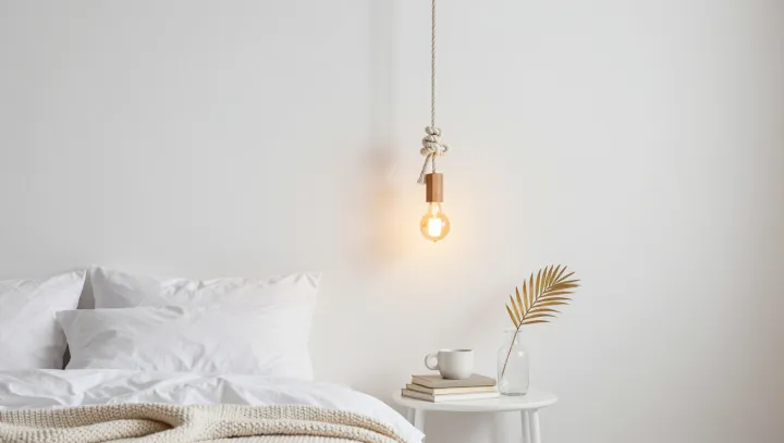
Light deserves as much attention as paint. A lamp placed to create an angled reflection can reveal the contours of a gold-toned chair or table, though the result depends on the viewer's position and the finish itself. A satin surface will scatter highlights more softly than a polished one. Test the arrangement from the seat, not just the doorway. In a room built around a single warm color, the smallest shadow can give a glint somewhere to live.