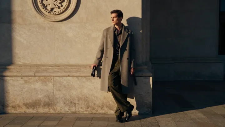
Matching is overrated. A brown overcoat, dark shirt and patterned olive trousers make a stronger case for earth tones when their differences remain visible: each piece holds its place, while the restrained palette keeps the outfit from falling apart. Black shoes finish the composition without asking to be mistaken for another shade of brown.
Contrast gives the eye somewhere to go. In color theory, value describes a color's relative lightness or darkness; a dark shirt against a lighter coat can make the boundary between layers easier to read. The effect is clearest when the coat is open. Pattern adds another distinction, breaking up the olive trousers so they do not merge into a single block of color. Yet the colors share enough warmth and muted character to feel related. Difference supplies definition; family resemblance supplies order.
Texture matters as much as hue. A coat with a matte surface, for example, can sit comfortably beside a smoother shirt, because the fabrics catch light differently even when their colors are subdued. That contrast need not be dramatic: a little variation in weave or finish can separate adjacent layers without introducing another color. Black shoes act as a visual anchor, giving the lower edge a firm stop rather than competing with the trousers' pattern. The lesson is not to make every item conspicuous, but to let each one contribute a distinct note. In the quiet space between coat and shirt, an outfit finds its shape.