
What Tom and Jerry Taught UX About Silence
The slapstick chaos of Tom and Jerry hides a precise visual language that modern UX designers mine for timing, clarity, and emotion without a single spoken word.

The slapstick chaos of Tom and Jerry hides a precise visual language that modern UX designers mine for timing, clarity, and emotion without a single spoken word.
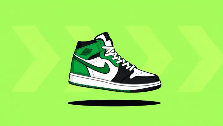
Limited-edition sneakers, once just subcultural trophies, now trade as a shadow asset class whose liquidity, pricing data and volatility sometimes rival equities.

Industry codes printed on cherry cartons, not the headline J-size label, are emerging as the more reliable signal for sweetness, density and firmness assessment in premium cherry buying.

Professional florists favor single-flower arrangements because visual focus, rhythm, and perceived scarcity make one species in quantity feel more luxurious than a mixed bouquet.

Rewatching SpongeBob as an adult reveals how its absurd humor quietly trains a child’s brain to handle ambiguity, encode memories, and test social norms.

A slapstick cartoon about a five-year-old boy has evolved into a sharp portrait of Japanese adult life, consumer culture, and family psychology through repetition, satire, and quiet realism.

Tidal friction between Earth and the Moon makes our planet’s rotation slow, lengthening the day while the Moon drifts outward by a few centimeters each century.

A powerful coastal typhoon can drench cities while at the same time reducing human heat stress by cutting solar radiation and limiting net heat gain at the surface.

Hand sketching remains central to car design because it compresses cognition, supports entropy-rich exploration, and shapes brand identity before 3D tools lock geometry.

Volleyball’s repeated jumps and landings create brief mechanical stress on teen bones, triggering remodeling and mineral deposition that increase bone density and long‑term skeletal strength.

Psychologists argue that slightly sub‑dream goals exploit marginal effects in motivation and perceived self‑efficacy, creating a repeatable loop of wins that compounds confidence.