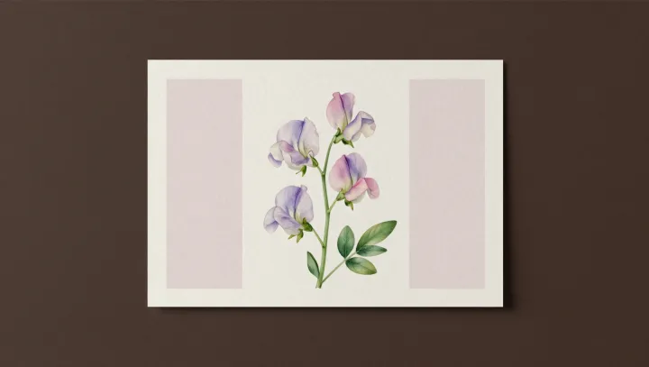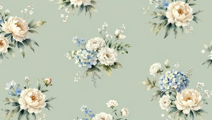
Coolness, here, is an illusion with teeth. Soft blue‑and‑white floral wallpaper triggers a perceptual bias long before any thermostat reading enters awareness, because the visual system quietly links short‑wavelength hues with low environmental temperature.
Color psychology sounds like décor gossip, yet its roots sit in sensory neuroscience and environmental physiology. Short‑wavelength light, dominated by blues, is processed in the visual cortex alongside context cues that past experience has tied to shade, water, and distance; this conditioning nudges thermal perception so reliably that laboratory studies find people report a lower “neutral” temperature in blue rooms than in orange or red ones, even under identical radiant heat and air flow.
Pattern does not stay innocent either. Fine, airy florals reduce perceived enclosure and visual density, which alters interoception, the brain’s running estimate of internal state. When walls feel lighter and farther away, the autonomic nervous system downshifts subtle responses such as skin blood flow and sweating thresholds, so the body reads the same air as slightly less stifling. Even the high contrast of white against pale blue increases luminance, mimicking cooler daylight and reinforcing the brain’s statistical guess that such spaces are less warm.
Thermal comfort, then, is partly a story the eyes tell the skin. A room wrapped in soft blue flowers stays physically unchanged, yet the brain’s predictive coding leans toward shade over sun, breeze over ember, and the body behaves as if a window had just been opened.