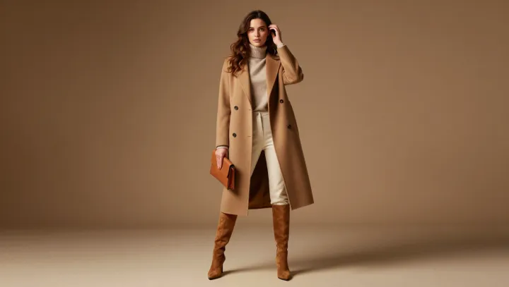
An outfit drained of color often reads richer than one shouting in neon. Camel, cream and soft neutrals push every spotlight onto texture, cut and proportion, which are the real luxury markers, while saturated, trendy shades tend to pull attention toward novelty instead of quality.
Pricey looks rely on visual cohesion. A narrow neutral palette behaves almost like a built‑in color filter, flattening contrast so seams, drape and fabric density become visible, much as a monochrome photograph reveals structure once hue is stripped away. Designers quietly exploit color theory and value contrast here: close‑toned neutrals reduce visual noise, so even mid‑range pieces appear part of a deliberate system rather than random separates thrown together.
Status, in style, is rarely about shouting for attention; it is about signaling that you can afford restraint. Soft neutrals suggest a slower trend cycle and invite investment fabrics like cashmere, brushed wool and matte silk, whose surface qualities show best when not competing with loud prints. Bold, of‑the‑moment color stories can still look sharp, but they need impeccable fabrication and tailoring to avoid reading like disposable fashion, while a quiet run of camel and cream grants even simple garments an aura of permanence.