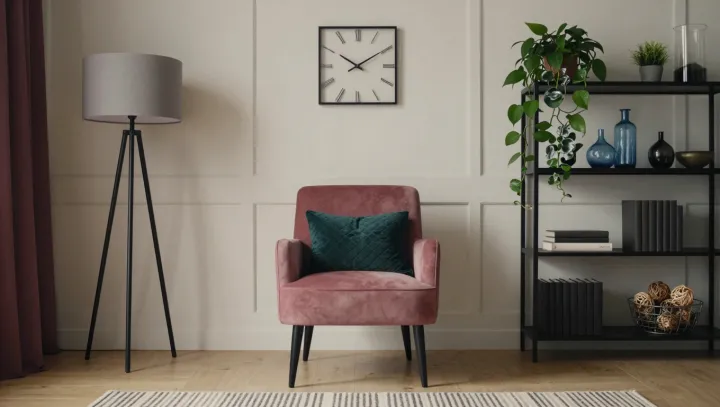
The pink chair is not changing; the room is changing it. Against neutral walls and black furnishings, its upholstery takes command, while a dark green cushion supplies a counterpoint. The effect is subtle. What looks warm in one setting can seem cooler in another, even when the fabric itself remains the same.
The eye is an unreliable judge of color in isolation. Through simultaneous contrast, a color's appearance shifts in relation to adjacent colors: a pink beside a warmer hue may look cooler, while a cooler neighbor can make it seem warmer. The green cushion, depending on its particular shade, can also make the pink appear more vivid. Black offers a different kind of contrast, setting the chair apart through differences in lightness rather than supplying a competing hue. The boundaries do the work.
Light complicates the verdict. Color constancy helps the visual system recognize surfaces under changing illumination, but that correction is imperfect; warm or cool light can alter the wavelengths reaching the eye and change how the upholstery appears. Neutral walls matter too, since their undertones can nudge the comparison in either direction. A fabric swatch that pleased in a showroom may read differently beside the intended cushion and wall, making it sensible to inspect the combination under the room's own light. The chair holds its place. Its color belongs partly to everything around it.