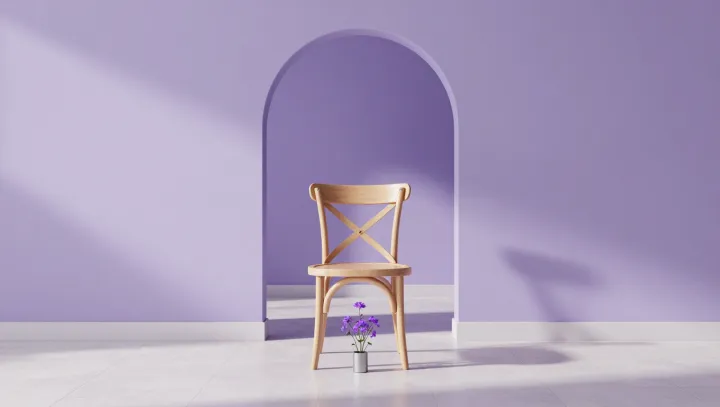
The chair is not changing; its surroundings are. Against a lavender backdrop, the warm notes of a wooden cross-back can seem more pronounced, while purple flowers draw the eye between the furniture and the wall. The effect is subtle. A familiar object acquires a different temperature without a drop of paint.
Color is less independent than it looks. Through simultaneous contrast, a neighboring hue can alter how a color appears, making the wood's amber or reddish notes stand out against cooler lavender. Color constancy also shapes perception: the visual system interprets a surface in relation to its illumination and setting rather than treating every reflected wavelength as an isolated signal. The result is not automatic. The chair's finish, the shade of purple, and the light all matter; a warm cream wall, for instance, may make the same wood look comparatively cooler.
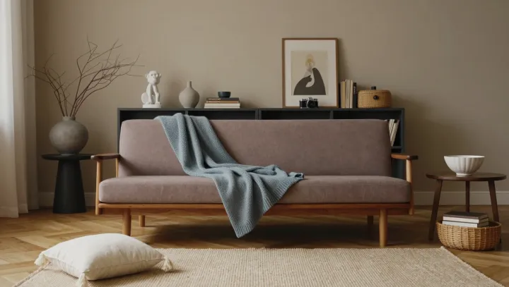
Texture gives the arrangement its restraint. The chair's grain and firm lines sit beside soft petals and a comparatively smooth backdrop, so the coordinated purples do not flatten the scene into a single color statement. Keep the flowers close enough to connect the chair with the wall, but leave the wood exposed; its visible grain supplies contrast that color alone cannot. Test the combination under the room's usual lighting, since a bulb or a shift in daylight can change both the wood's appearance and the balance of the purples. The chair stays still. Around it, the room does the talking.