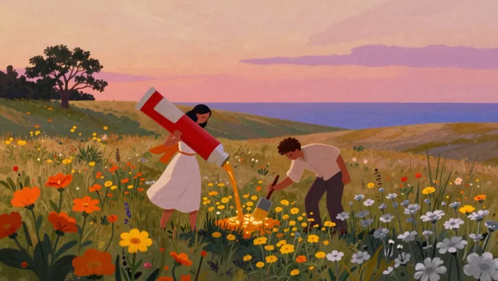
A flower can glow without a brighter stroke of paint. The trick is in its company. In a whimsical coastal meadow, a woman pours orange paint while a man brushes color onto flowers; their imagined work hints at a real principle of vision, in which a color's appearance depends partly on what surrounds it.
The surrounding field matters more than another squeeze of pigment. Luminance contrast helps explain why a flower may seem lighter against a darker patch than it does against a pale one, even when the paint on its petals remains unchanged. The eye makes comparisons. Simultaneous contrast, a related effect, can also shift the apparent character of a color when it sits beside another: an orange flower against subdued blue or green may look more vivid than the same orange amid equally intense warm hues. These effects depend on the particular colors and their arrangement, not on a magic pairing.
Restraint, then, can do the work that extra paint cannot. A painter might darken the grasses immediately behind a blossom, soften nearby colors, and reserve the strongest contrast for a few petals rather than treating every flower as the star. The result is an impression of light, not light emitted by the canvas. In the meadow, the orange still comes from a vessel and a brush; its apparent radiance belongs as much to the quieter colors left around it.