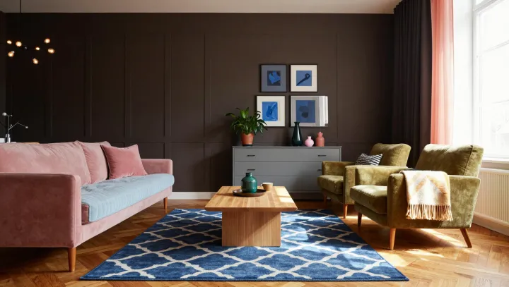
A dark wall can make a colorful room feel calmer, not gloomier. Against its continuous surface, a pink sofa and mustard armchair no longer compete with a pale backdrop for attention; they stand out as distinct pieces within the same frame. The colors still clash. The room has given that clash a setting.
Contrast, rather than matching, does much of the work. A dark surface establishes a low value, the design term for a color's relative lightness or darkness, allowing lighter or brighter upholstery to register clearly. Simultaneous contrast can also affect how neighboring colors appear, although the result depends on their exact shades and the available light. The patterned rug has another job: if it picks up tones from either chair or sofa, it can carry the eye between them without insisting on an exact match. Repetition need not be literal. A muted echo in a cushion or a small object may be enough.
The wall is not a magic fix. Its undertone matters: a dark blue, green, or brown will interact differently with pink and mustard, while daylight and lamps can alter the apparent balance. Test paint beside the upholstery, not in isolation, and look at the combination under the lighting the room will actually use. Leave some quieter surfaces around the pattern so each piece has space to register. In a room built on disagreement, the darkest surface gives every voice a place.