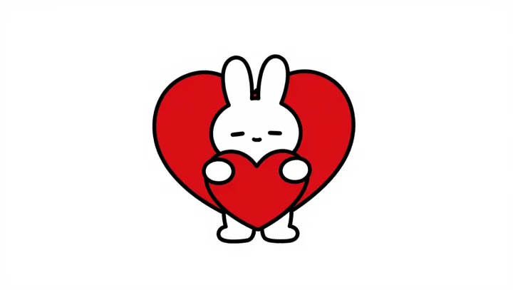
The cat needs less detail than the heart needs room. Drawn in white against a plain background, it holds an oversized red heart whose bold outline gives the image its immediate force. The arrangement is simple. Its visual priorities are not: the animal supplies a familiar figure, while the heart carries the message.
Recognition is often a matter of selection, not completeness. Visual abstraction removes detail while preserving enough of a subject's distinguishing form for a viewer to identify it. A few well-placed lines can suggest an animal without describing fur, anatomy or depth. The background helps too. With little else competing for attention, the contrast between the outline, the white figure and the red heart makes each element easier to pick out.
Exaggeration gives the picture its emotional volume. In character design, proportion can direct attention toward a gesture or expression; here, the heart's size makes affection hard to miss even without a detailed facial expression. That is visual hierarchy at work: the largest, most vivid element commands attention, while the cat gives it a holder and a humanly legible gesture. The picture does not need to explain whom the cat loves, or why. The uncertainty is part of its reach. One small figure remains, holding more feeling than its lines could contain.