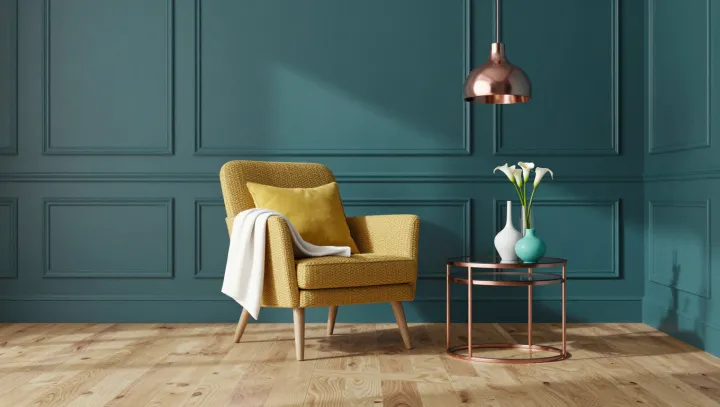
A yellow armchair can balance a room with far more teal than yellow. Area is not authority. Against paneled walls, the chair draws attention through its brightness and contrast, while the surrounding color supplies a steady backdrop. Pale wood and metallic accents temper the exchange without demanding equal billing.
Brightness carries more weight than a simple floor plan might suggest. A light yellow chair can stand out sharply against darker teal because of luminance contrast: the difference in perceived lightness between neighboring surfaces. Saturation matters too. A vivid yellow tends to attract more attention than a muted one, although lighting, texture and the particular shades will change the effect. In this room, the broad walls establish the mood; the smaller chair supplies a focal point. The colors need not occupy matching areas to feel balanced.
Restraint elsewhere makes the pairing more convincing. Pale wood introduces a lighter surface that eases the transition between chair and wall, while metallic details catch light in small doses. Too many bright accents could compete with the chair; a larger expanse of yellow could shift the balance toward a more insistent scheme. Even the finish matters: reflective metal produces localized highlights, whereas the broad wall color is distributed across the room. The eye moves between these unequal partners, finding order not in sameness but in their measured difference.