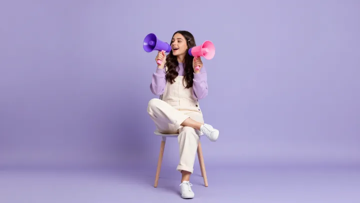
That lavender outfit is not soft at all; it is a calculated optical machine. Slight shifts in value do the heavy lifting, as the clothes sit a notch lighter than the backdrop, so the eye reads a clear luminance boundary instead of a blur. Human vision is wired to lock onto value contrast faster than hue contrast, so even near‑identical purples separate cleanly when one is fractionally brighter or darker across its surface.
More surprising is how temperature, not just color name, carves out the body. Cool, bluish lavender against a red‑leaning purple background creates chromatic aberration in the viewer’s cones, a tiny tug that outlines the figure without any drawn line. Add directional lighting and you get form: specular highlights on satin, soft diffuse reflection on knit, and cast shadows under folds, all driven by basic radiometry and reflectance. Those micro‑gradients in shading, amplified by fabric texture, give the outfit three‑dimensional modeling even when the palette barely shifts on the color wheel.
The final trick is edge control, not drama. Stylists and photographers often keep a thin halo of separation light on shoulders or hair, a classic rim‑lighting move that spikes local contrast exactly where background and garment might otherwise merge. Combined with a slightly defocused backdrop or a different gloss level on the set surface, the result is a tight figure‑ground relationship: monochrome to the casual viewer, but under the hood, a stack of value, temperature, texture and lighting cues working in precise concert.