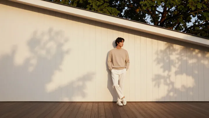
Pale stone wins here. When daylight skims an ivory wall and a sand-colored jacket, the effect is not retreat but control: nothing shouts, so proportion, texture, fit, and the clean relation between objects must carry the claim, leaving no visual noise to hide a timid decision. You notice the restraint. Dark pigment can conceal weak choices; light neutral palettes expose them.
Authority need not brood. In color theory, luminance describes perceived lightness, while simultaneous contrast explains why a cream surface gains definition beside charcoal trim, warm wood, or a precise black line; the eye reads boundaries before it assigns mood, then uses those signals to judge order. That is the trick. High-value neutrals also alter social distance: they suggest accessibility without surrendering hierarchy when materials hold their shape, seams stay precise, and surfaces remain uncluttered; a pale field can feel exacting when every edge earns its place. No armor required.
Guardedness is overrated. If you want a room, a uniform, or a public identity to project command, leverage contrast sparingly and protect the silhouette; visual hierarchy comes from disciplined edges, repeatable spacing, and deliberate empty space, rather than drowning every surface in black or hiding indecision behind drama. Start with the light. The payoff is authority that invites scrutiny rather than fearing it, because pale tones make each decision visible, from the cut of a sleeve to the gap between objects, and that exposure can read as nerve. Would you wear it?