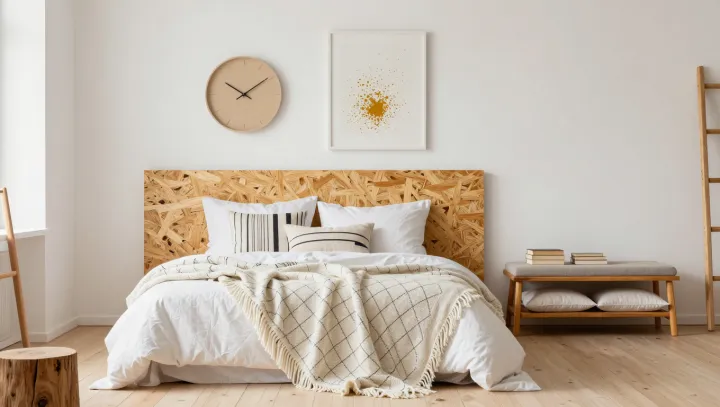
Beige is not boring. When a room feels flat, the problem can be surfaces that behave too similarly under light, rather than a shortage of color. Texture supplies the friction. Against a smooth plaster wall, a loosely woven curtain introduces small shadows and irregular edges, giving the eye something to register without adding another hue.
Sameness is the culprit. A glossy ceramic bowl and an unglazed vessel can share nearly the same shade, yet their different surface finishes produce visibly different patterns of reflected light. The distinction is physical. Specular reflection produces concentrated highlights on smooth surfaces, while diffuse reflection scatters light across directions, helping rougher finishes appear softer under the same illumination. Scale matters as well. A broad rib in upholstery reads differently from the fine grain of timber, so combining them creates contrast that survives beyond the close inspection of individual objects.
Restraint makes this work. Rather than scattering textured accessories across every shelf, give a few substantial surfaces different jobs: linen at the window, wool underfoot, polished stone beside a chair. Lighting deserves equal attention. Side lighting can reveal shallow ridges and woven fibers that frontal illumination makes less apparent, although the effect depends on the material and viewing angle. Not everything needs roughness. Leave smooth areas between tactile ones, and the room gains pauses rather than clutter; against quiet walls, a single folded blanket can hold the afternoon's smallest shadows.