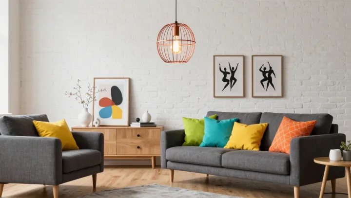
A colorful cushion owes much of its punch to the room around it. Against neutral furniture and white brick, its hue can appear sharper than it would beside a similarly colored wall. The cushion has not changed. Its neighbors have, and the eye judges color in company.
Contrast is an unreliable accomplice. Through simultaneous contrast, a color can appear different when placed against different surroundings: a warm cushion beside a cool surface may seem warmer, while a backdrop close to its own hue can make it less distinct. Light complicates the picture. Daylight and electric bulbs differ in spectral power distribution, the mix of wavelengths they emit or transmit, so the same fabric may reflect a different balance of color under each. White brick is not always neutral to the eye, either; shadows in its texture and light reflected from nearby objects can give it a warmer or cooler cast.
The room works best when its accents converse rather than compete. Framed artwork can repeat a cushion color in smaller doses, while a sculptural pendant draws attention through form as well as light. Before buying more, move a cushion from the sofa to a chair and look at it under both daylight and the lamp intended for the room. A strong hue may need no companion at all; a quieter one may gain definition beside a contrasting fabric. On the white brick, a frame holds its color still, though the room never quite does.