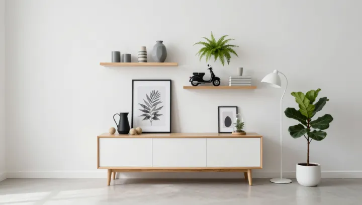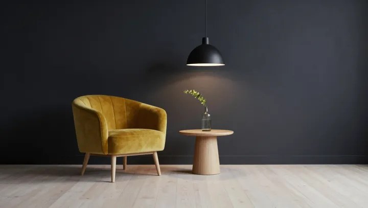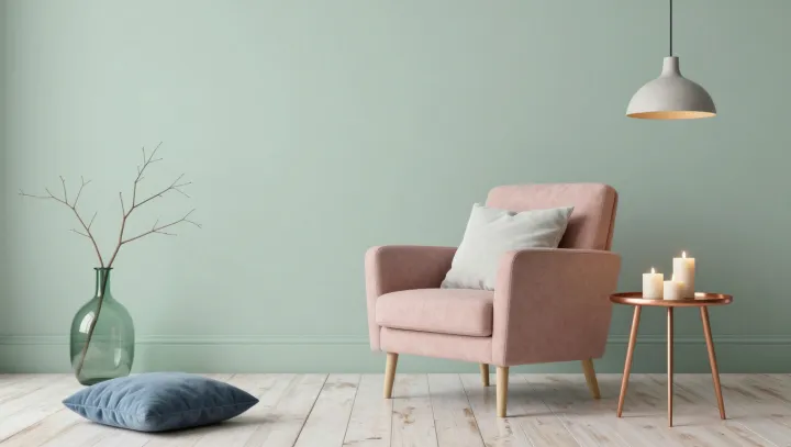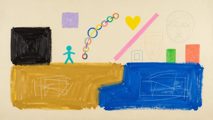
A color is never quite alone. Set the same orange block against cream and then against deep blue, and its character appears to shift, even though the orange itself has not changed. In retro color blocking, the border between colors does much of the work.
The eye is a comparative instrument, not a paint meter. Simultaneous contrast describes how a surrounding color can change the appearance of a neighboring patch: a gray block may look lighter against black than against white, while a colored surround can make an adjacent neutral seem tinged with its complementary hue. Lateral inhibition, a process in visual circuits that helps accentuate differences across boundaries, contributes to some forms of contrast, though color perception also depends on processing elsewhere in the visual system. The effect is contextual. Size, lighting and the proportions of adjacent blocks can change its strength, so a pairing that sings on a small swatch may feel harsher across a wall.
Retro palettes make this instability useful. Mustard beside brown can seem earthy and restrained; placed near violet, it may appear more vivid, because the neighboring hues create a stronger contrast. Neither impression is a property of mustard alone. Designers can test the effect by repeating one patch across several backgrounds, keeping the lighting and patch size consistent. Such comparisons reveal why choosing colors one at a time is a poor substitute for judging them together. At the edge of each block, the color seems to negotiate its identity.