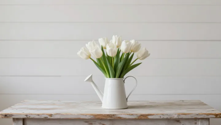
That sense of purity is a bias, not a property of the petals. Against a white mug and a pale wooden table, the tulips look stripped of doubt because the eye stops treating them as objects in clutter and starts reading them as a single, coherent patch inside one tidy visual story.
What feels like “truer” white is really the brain’s color constancy engine cleaning up noise. Photoreceptors in the retina record messy mixtures of wavelengths, yet circuits using lateral inhibition and simultaneous contrast reweight those signals so edges, not absolute values, dominate. When mug, table, and petals sit inside a narrow range of luminance and hue, the gradients between them shrink, so the petals lose distracting boundaries and appear optically resolved, almost ideal.
Designers often assume more contrast makes colors pop, but white behaves like a quiet insider, not a showman. Put the same tulips near saturated fabrics or a dark ceramic and the visual cortex, chasing local contrast, exaggerates tiny tints in the petals, pushing them toward cream or gray. Surrounded by whites, though, the reference frame tightens: illumination is inferred as stable, chromatic adaptation locks in, and those slight impurities fall below the perceptual threshold, leaving a curated illusion of purity on that pale wooden stage.