A nearly colorless still life can feel more like spring than any saturated flower market poster. That is not an accident but a calibrated play on human perception, where restraint heightens sensitivity and small shifts in hue carry disproportionate emotional weight.
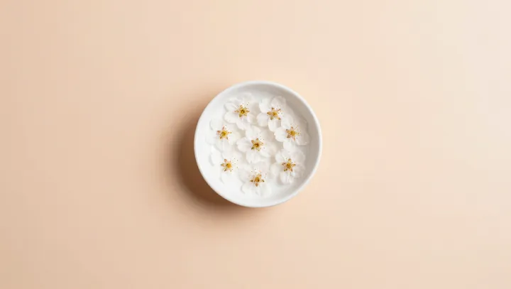
Color works harder in a quiet frame. Against a soft peach ground, a white bowl and pale blossoms sit in low chroma, so the eye locks onto micro-variations in value and temperature that a crowded bouquet simply drowns. In visual psychophysics, reduced stimulus complexity increases sensitivity; minimal scenes raise our threshold for noticing faint tints, like the barely green of a new bud or the warm cast of late afternoon light.
Simplicity also rewrites time. A single bowl on a clear field suggests transience, echoing concepts like figure–ground segregation and Gestalt closure; the brain completes the absent garden, the missing breeze, the unseen tree. Bright, dense bouquets behave more like advertising: they shout, then flatten. The pale arrangement whispers instead, and because perceptual load stays low, associative memory fills the silence with seasonal cues, from damp soil to cool air, making the almost-color read as the first breath of spring rather than its noisy climax.