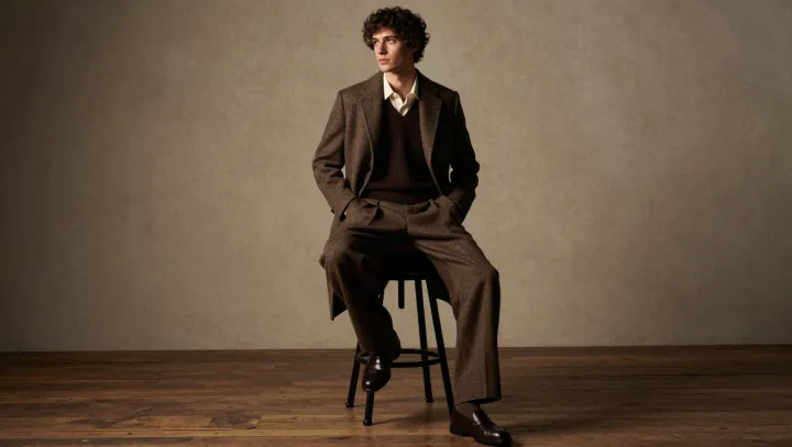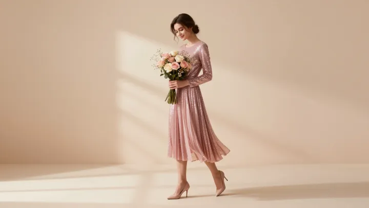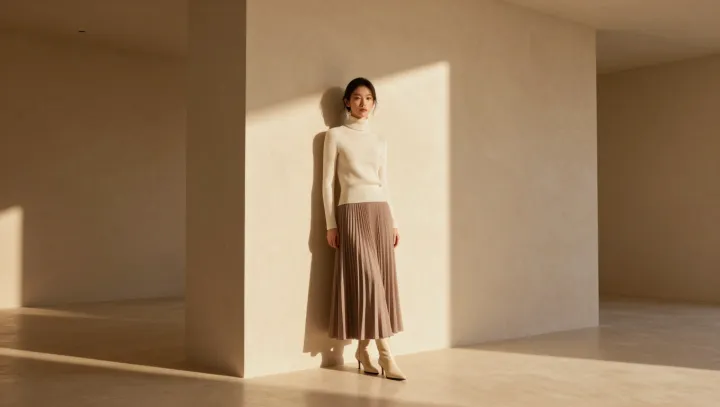
Light outranks pigment here. Across charcoal, ink, and stone garments, a hard side beam can cut the torso into planes, so that one sleeve recedes while another catches the eye with more force than any saturated hue. This is not restraint. It is visual hierarchy: directional illumination gives similar tones unequal jobs, turning an outfit that might read as flat under diffuse light into a deliberate composition.
The eye is not democratic. Retinal adaptation continually resets sensitivity to ambient luminance, while edge detection privileges abrupt changes in brightness; together, those mechanisms make a dark lapel beside a lit cheek register as structure rather than decoration. Color can entertain. But luminance contrast organizes attention faster, especially when the palette withholds competing chromatic signals and lets shadow establish rank, depth, and the impression of physical mass. The trick is optical. It relies on the visual system's preference for boundaries, even when every garment piece belongs to one narrow tonal family.
The authority is conditional. Matte wool, dense cotton, and brushed surfaces absorb and scatter light in ways that preserve broad tonal blocks, whereas glossy fabric can fracture the effect into distracting specular reflections. Control is the point. Place the key light off-axis, keep the background quieter than the subject, and the near-monochrome look acquires chiaroscuro without costume drama. Silence follows the frame. In that narrow corridor between black and gray, command arrives as an absence of noise.