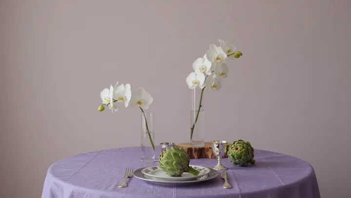
A white orchid centerpiece needs contrast, not another color, to give a table depth. Height does the work. When stems rise from glass vases at different levels, their blooms overlap and separate, drawing the eye through the arrangement rather than leaving it to settle on a single flat band of flowers.
Texture supplies the tension that color might otherwise provide. Orchid petals scatter light softly through diffuse reflection, while glass and polished metal produce sharper highlights through specular reflection. Artichoke leaves add ridges and shadows. Set low among the vases, their layered forms make the smooth petals look softer by comparison; their muted green can also lend a quiet accent without becoming the dominant color. Clear vessels keep the stems visible, adding another set of lines between the tabletop and the flowers. Keep some space between them. Too many overlapping stems can turn that transparency into visual clutter.
Light is the most economical finishing touch. Illumination from one side casts small shadows beneath petals and along artichoke leaves, making their contours easier to read, while a metallic accent catches a glint that shifts with the viewing angle. Avoid placing a bright lamp directly in guests' eyes or relying on mirrored surfaces alone: glare can obscure the details that give the arrangement its shape. A few low candles, safely separated from foliage, can add flicker alongside steadier room lighting. The result depends less on abundance than restraint. Across the table, a pale petal holds the light while its neighbor falls quietly into shadow.