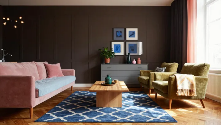
Blue is only as crisp as its company. Against one neutral, vivid bedding and a matching lamp can appear clean and luminous; against another, the same blue may seem subdued. The difference lies not just in the blue itself, but in the quieter colors surrounding it and the light falling across them.
Neutral is rarely truly neutral. White, gray and beige often carry undertones of yellow, pink, green or blue, which become easier to notice when colors sit side by side. A blue with a green cast may feel especially fresh against a warm, creamy wall, while a gray with a similar cool cast can make the pairing feel quieter. Simultaneous contrast helps explain the shift: neighboring colors influence how the eye perceives each one. Lightness matters too. A pale wall can sharpen the outline of saturated bedding, while a darker neutral may soften the contrast.
The safest palette is the one tested in place. Set paint samples beside the bedding and lamp rather than choosing a wall color from a small swatch in isolation; compare them near the furnishings that will remain in the room. Daylight and electric light differ in spectral composition, so inspect the combinations under both before committing. Look for unwanted pink or green casts, and decide whether the blue should stand forward or settle into the room. A neutral that looks unremarkable alone may give the blue exactly the company it needs. In the finished bedroom, the quietest color can still do the most talking.