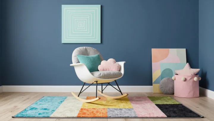
Matching is overrated. A cushioned rocking chair, a colorful rug and playful artwork can share a corner without wearing the same shade, provided that a few colors recur in smaller accents. The eye finds connections among the differences, while soft surfaces give the arrangement an invitation to linger.
Repetition works best with restraint. A rust mark in a print might return in a cushion seam; a blue patch in the rug could echo in a small ceramic object on a nearby shelf. These touches establish color harmony without requiring identical hues, which can make a room feel flat or overly prescribed. Scale matters too. A large rug can carry several colors, while smaller objects pick up just one or two, creating a visual hierarchy that lets the eye move easily between them. The colors need not appear in equal amounts: a trace can be enough to make a connection.
Texture deserves equal billing. A padded seat and a soft rug temper the energy of contrasting colors, offering comfort as well as variation in how surfaces catch light. Keep the artwork playful, but leave some breathing room around it; a crowded wall can compete with the chair rather than draw attention toward it. There is no need to buy a complete set. Start with what is already in the corner, notice a color worth repeating, and try it in a small object before committing to anything larger. The chair rests between color and quiet, ready for someone to sit.